69.2% — This is an average online shopping cart abandonment rate for eCommerce retailers. It looks like most of the potential shoppers just add goods to the shopping cart and never finish their online purchases. Why?
According to a survey, there are dozens of the reasons why a shopper decides not to finish checkout, the most often mentioned are:
- Extra cost (61%)
- Forced account creation (35%)
- Complicated checkout process (27%)
- Impossibility to see the total order cost up-front (24%)
With this information, it seems quite easy for designers and marketers to fix their shopping carts and get money flowing in. However, the survey conducted in 2016 proved that reasons for the cart abandonment remain the same as they were in 2013.
The checkout process, can be complicated at times and require a lot of time to share required data. Both of these issues, plus unexpected additional costs can confuse or upset many shoppers. Marketers still have a lot to do to improve the conversion rate within a shopping cart.
Let’s take a look at 10 ways how we can improve the checkout process now.
1. Total Cost After Adding to the Shopping Cart
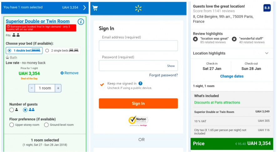
Lots of people click on the shopping cart just to see the final cost. Don’t make people fill in any details about themselves or register to see the full estimated price.
Booking.com does this in a beautiful way: they show the total estimated cost at once and at checkout they show what the total price consists of, adding no extra fees. There is a possibility to sign in or to proceed to the check out without registering. With this strategy you create trust, and you can’t make a sale without trust.
2. Cost Description
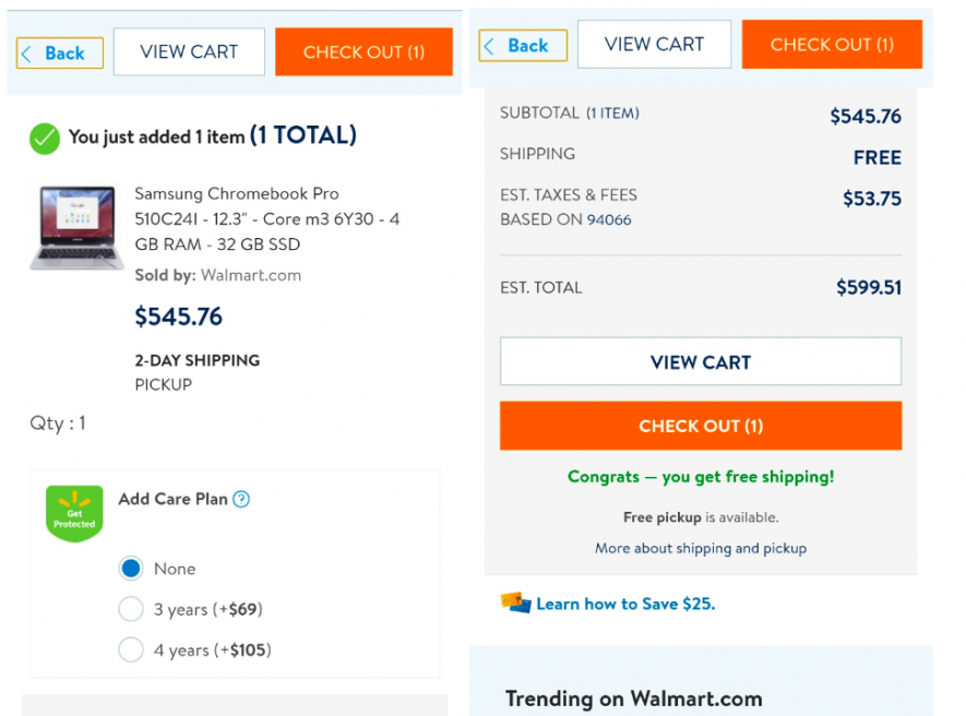
Show all extra fees and taxes, even if shipping fees equal 0 if you offer free shipping. Buyers who don’t see how the price was estimated may wonder if all the costs were included in the price and if there are any hidden fees.
If you offer additional services, make it easy to show the costs for each service in checkout and add them to your cart.
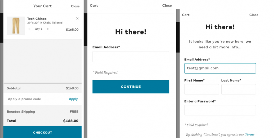
3. No Obligatory Account Registration
Bonobos requires every shopper to register for checkout. Although a buyer can see the total price in the shopping cart, a person can not buy anything unless he/she has finished the whole registration procedure.
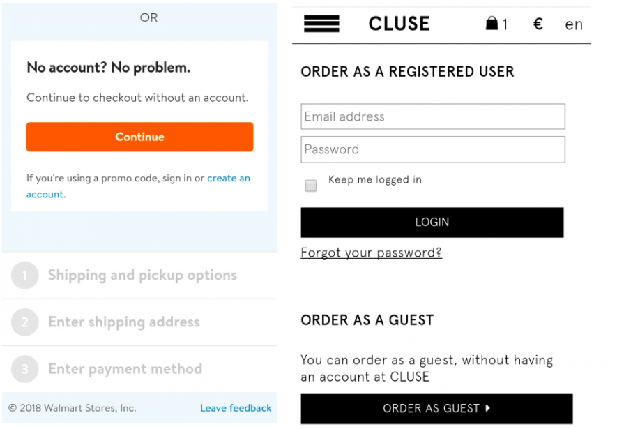
In contrast, Walmart and Cluse make it easy to buy even if a shopper doesn’t want to register by offering an “Order as a Guest” option.
4. Display Prices Correctly Depending On The Location
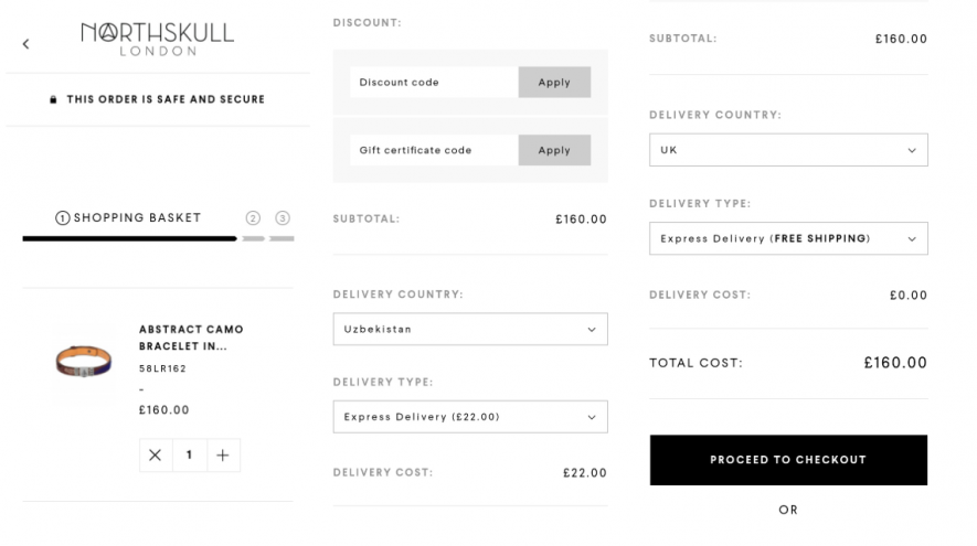
If the total price depends on the country the product will be shipped to, allow a user to choose the country before displaying the full price. An example below, we can see that with Northskull shipping within the UK is free, and the final price will be 22 pounds cheaper than for Uzbekistan.
5. Show The Discounts On The Checkout Page
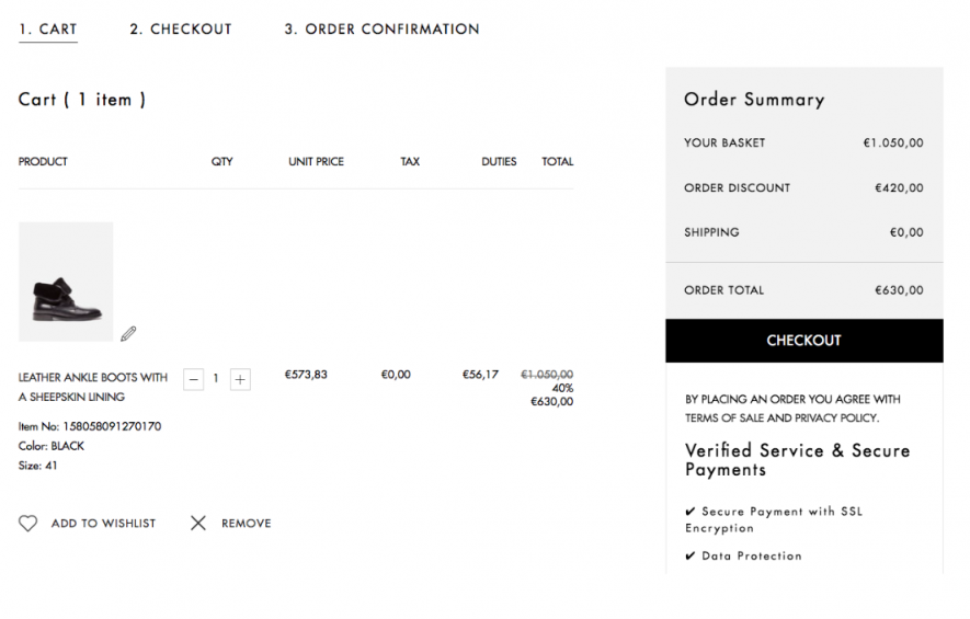
Prove that a buyer is making the right decision by showing how they can save money at the moment they need to provide credit card details at checkout. Reinforce the decision by reaffirming the benefits a shopper gets buying right now. These may include:
- Money saved (40% off in the example) along with the original prices of the product(s)
- Free returns policy
- Free shipping
- Free support
6. Show Complementary Products
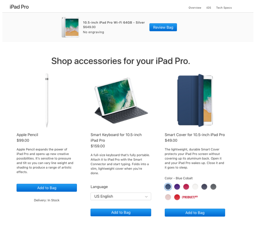
Sometimes when you buy a product, you forget to buy an accessory that is needed for the product to work. A quick reminder “Did you forget to buy?” just before the checkout can save time and effort. Plus, if you have a designated amount spent that equals free shipping, an added accessory could help a buyer obtain that bonus.
Use the last checkout page to announce promotions related to the upsales: what a client can buy right now cheaper or what complementary goods other shoppers usually buy with the product chosen.
7. Create A Cart Dropdown
Making a shopping cart easily reachable and viewable, helps buyers see what they have ordered before they proceed to checkout.
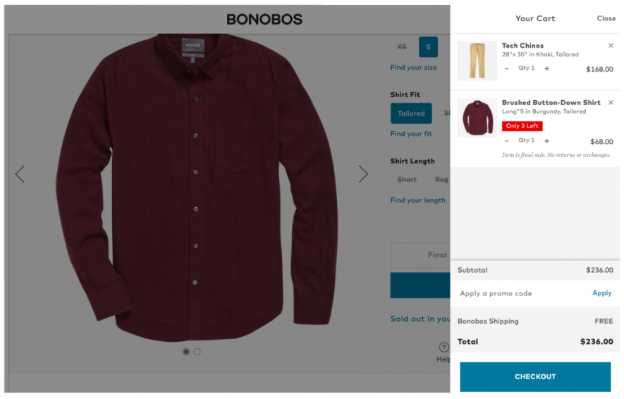
Make it possible to go to the checkout and see what you have ordered without leaving the current page. For example, Bonobos shows a drop-down with the goods chosen when a user hovers a basket. Notice that from this view the buyer can also see that a promo code option is available. They can see what they have spent, and what they have forgotten to add to the cart. Make sure that viewing your shopping cart is easy for potential buyers.
8. Give Them The Best Deal
When a customer sees an empty field “apply coupon” and they can’t fill it in, the feeling of missing a better deal arises. The shopper may start looking for a coupon code on the web or in email but if they can’t find one they can abandon the shopping cart or finish checkout not fully satisfied. Worst case, they go to another website that is offering the same product with a coupon code for a comparable price.
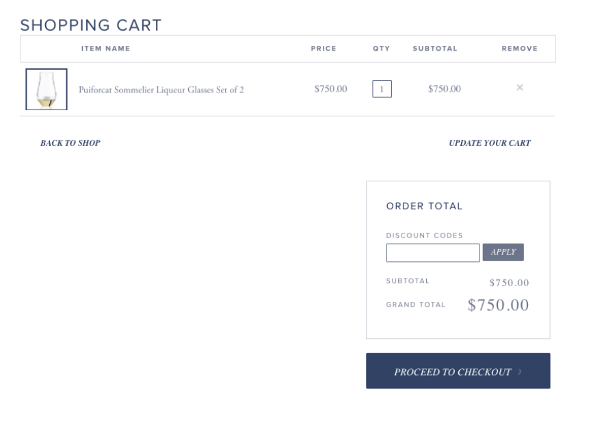
How you can deal with this problem:
- Give the website visitors a discount code for signing up for the newsletter and motivate them to make their first purchase. In this case, the empty field will be used by all first-time shoppers of the store.
- Make discount code field less visible. Grey box or a small font can make the “Apply coupon” box not so easy to notice for everybody making checkout. Those shoppers with a discount code will find the hidden box anyway.
9. Multiple Steps In Checkout Are Preferable
According to GoodUI customers prefer multiple steps in a checkout better than a single step checkout and up-front forms. You can break a long form with many entry fields into smaller parts or visually divide the form into modules. A multi-step process seems easier to users, and they keep filling in the fields one after one, following the checkout route.
A great example of this is the Walmart checkout, showing the exact steps you have to take to buy products.
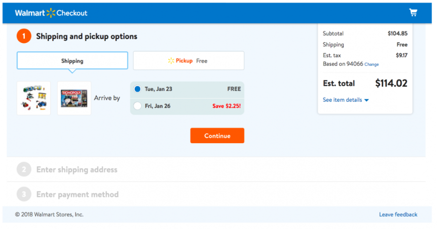
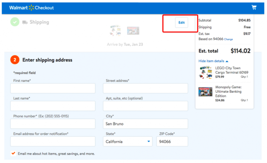
At the same time, Walmart lets you edit the data you have entered on every step. Make it easy to navigate between the steps through checkout.
10. Do Not Ask Them Too Much Information
If you know that most of your customers are returning clients, make it easy for them to register and then skip entering personal details during each checkout.
If a person is at checkout without registering, facilitate this process. Display at most 6 input fields at a time; if you need more information from users, break the boxes into the blocks or separate steps.
For the new customers, do not make them fill in the details about their date of birth and other data not obligatory for the shipping data, before buying anything.
Look at how Nike does it, removing all not compulsory fields and saving the time of the shoppers.
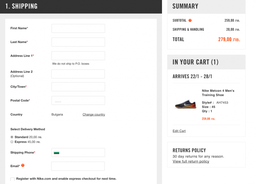
Also, you can use a single “Full name” field instead of “Name” and “Surname.” Studies show that 42% of customers type the full name in the field of the first name, and then notice their mistake. Combining the first and the last name into one field will let you reduce the number of fields and simplify the checkout process.
Sources
https://www.semrush.com/blog/how-to-stop-losing-shoppers-during-checkout/

